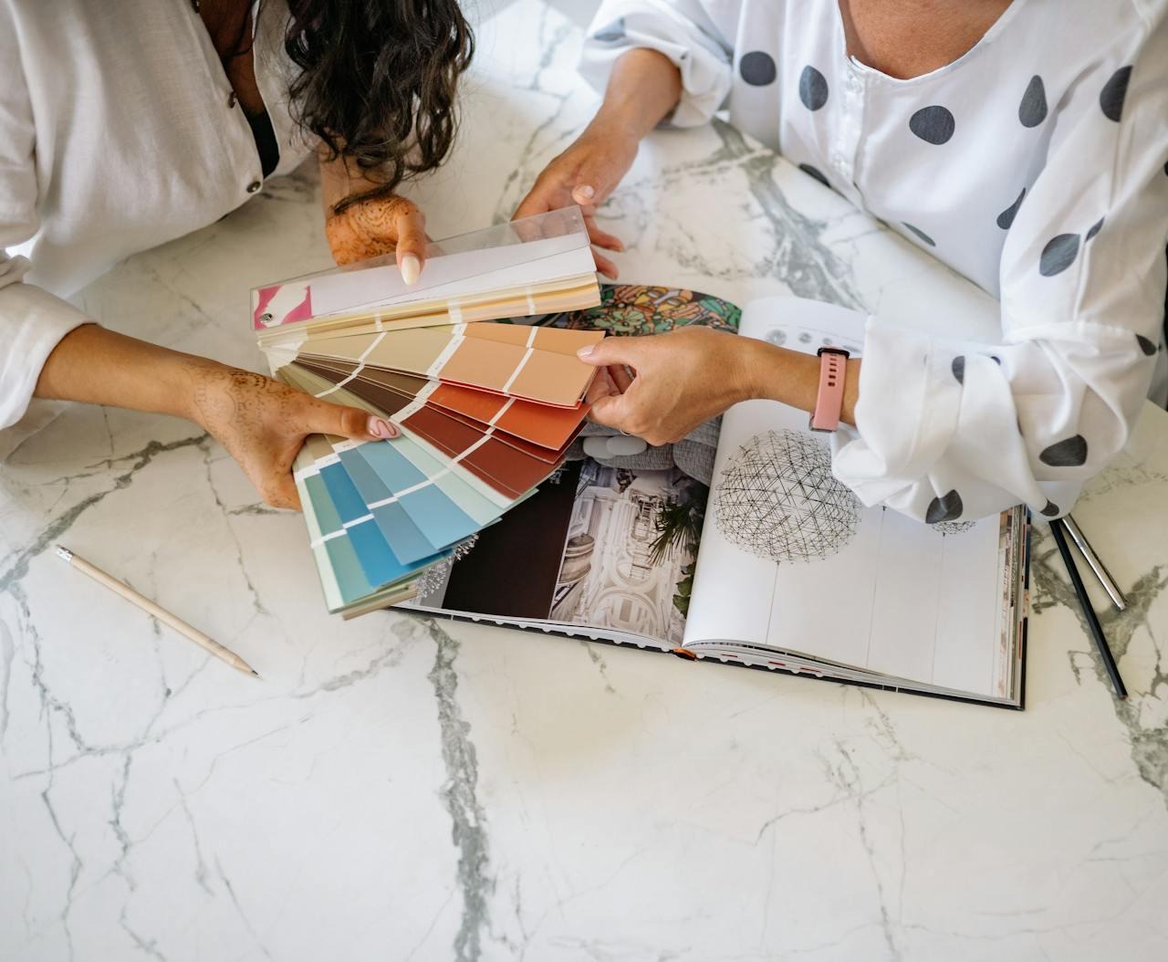
Selling a home isn’t just about upgrades or location. Color quietly shapes how buyers feel the moment they walk in. Before anyone notices square footage or finishes, their emotions respond to what surrounds them. A calm palette can make a small space feel larger, while harsh contrasts can make even a big room seem uncomfortable.
Understanding how color psychology works helps sellers use paint as a selling tool, not just decoration. The right shade can warm up cold corners, soften older details, and give buyers the feeling that a house is move-in ready. In today’s visual market, color often decides whether a home feels like the one.
Why first impressions start with color
When a buyer steps through the door, color does the talking before words do. It tells them whether a space feels inviting or uncertain. Soft tones such as beige, oatmeal, and greige create an atmosphere of balance that works with any style of décor. They also photograph beautifully, which helps listings stand out online.
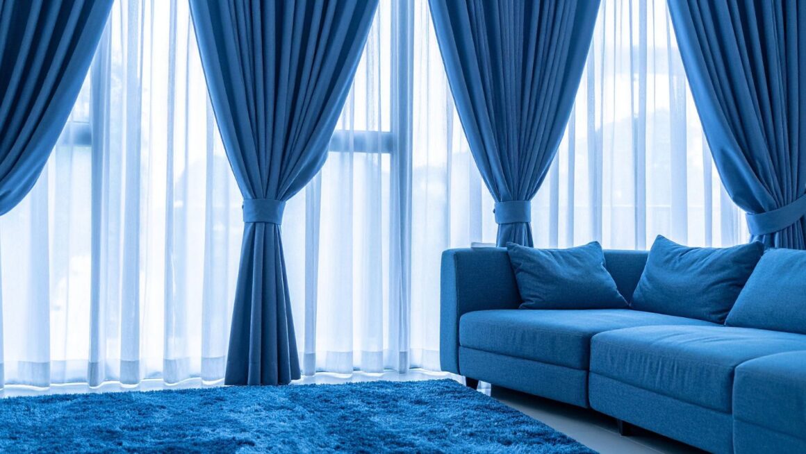
Cooler shades like misty blue or pale gray communicate order and cleanliness. These hues are ideal for open floor plans or modern interiors, where light bounces naturally from one surface to another. Pairing them with natural materials such as wood or stone adds warmth that keeps the look grounded.
Lighting completes the first impression. A color that looks calm in daylight may appear dull under a cool bulb. Testing paint at different times of day ensures each room keeps its appeal from morning through evening.
Why subtle shades attract serious purchasers
Color connects emotionally long before buyers process the details of a home. Blue conveys reliability, green suggests renewal, and off-white tones imply space and freshness. Together, they invite a calm feeling that buyers subconsciously link with security.
That emotional reaction is one reason companies like Chris Buys Home St.Louis pay close attention to how colors are presented during walk-throughs. They know that even budget paint can shift a buyer’s perception from needs work to ready to move in.
When colors transition smoothly between rooms, the effect feels intentional. It gives buyers the sense that the home has been designed thoughtfully, even if the updates are simple. Sellers who approach color this way often notice longer visits during showings and faster offers afterward.
Rooms that benefit most from color updates
Some areas influence buyer mood more than others. A few targeted color changes can refresh an entire property.
- Living Room: Greige or warm cream makes this gathering area feel balanced and adaptable. It softens light and pairs easily with existing furniture.
- Kitchen: Crisp whites and gentle grays promote a sense of order and hygiene. They let cabinetry, hardware, and counters take the spotlight.
- Bedroom: Pale blue, sage, or soft lavender encourages rest and quiet two emotions buyers crave in a sleeping space.
- Bathroom: Light aqua or off-white mirrors spa environments, and conveys cleanliness.
- Entryway: Sandy beige or ivory invites people in and sets an optimistic tone right from the door.
Using one neutral undertone family across these rooms ties everything together, helping buyers flow through the space without visual interruption.
When bold colors work in your favor
While neutrals dominate most listings, selective use of bold color can add depth and character. Deep navy on a dining room wall, forest green in a study, or matte black doors can elevate perception without overwhelming the space.
Exterior choices can make a similar difference. A bold front door in red, teal, or charcoal grabs attention in listing photos and signals personality before the showing even begins. The key is restraint accenting with intention rather than painting every surface in strong hues.
Pro Tip: Keep bold shades in smaller or transitional areas like hallways, powder rooms, or exterior trim. It creates visual excitement without making the home feel heavy or dark.
Lighting choices that complete the look
Even the best color loses impact under poor lighting. Warm white bulbs enhance creamy neutrals and make rooms feel cozy, while daylight bulbs highlight cooler tones and sharpen edges. Matching the light temperature to the paint’s undertone avoids the washed-out or overly yellow effect that can hurt first impressions.
Natural light direction also shapes how colors behave. South-facing rooms receive warmer sunlight and can handle cooler wall tones, while north-facing spaces may need a hint of warmth to offset shadows. Adjusting both paint and lighting ensures that every photograph and every showing presents the home at its best.
Color and emotion work hand in hand
Every shade tells a story. Beige suggests comfort, sage whispers calm, and soft white communicates care. Buyers rarely notice the color itself; they respond to the feeling it creates. When rooms flow together visually, that sense of continuity builds trust. It signals that the home has been maintained with attention and consistency.
This emotional rhythm can even guide how buyers move through the property. Warm tones encourage conversation in gathering spaces, while cooler tones invite reflection in private rooms. A thoughtful palette quietly directs the experience, making a showing feel natural rather than staged.
Small paint updates, big return
Repainting before selling remains one of the most cost-effective updates a homeowner can make. Fresh paint covers scuffs, updates dated shades, and instantly brightens the interior design. It’s a visible improvement that doesn’t require a large investment yet offers strong returns.
Smart sellers usually focus on:
- Refreshing high-traffic areas like hallways and kitchens.
- Painting trim, doors, and ceilings to create crisp edges.
- Using washable finishes that reflect light evenly for better photos.
These modest updates often reduce time on the market. A freshly painted home signals readiness, which helps buyers imagine moving in without extra work or cost.
Timeless tones that keep homes market-ready
Trends may shift every season, yet certain colors stay relevant across years and styles. For sellers wanting lasting appeal, these shades rarely disappoint:
- Soft white: Feels open and clean without being stark.
- Greige: Combines the warmth of beige with the freshness of gray.
- Sage green: Natural and calm, perfect for transitional designs.
- Pale blue: Peaceful and clean, ideal for bedrooms and bathrooms.
- Warm gray: Neutral with character, balancing modern and classic styles.
These tones age gracefully, ensuring your listing still feels current months down the line. They also give buyers the flexibility to visualize their own furniture and taste within the space.
A home that sells through feeling
Color isn’t decoration, it’s persuasion. It influences how buyers interpret light, space, and even care. The right palette can calm nerves, build trust, and make a property feel worth its price. Sellers who understand this connection use color as a strategy, not guesswork. With balanced tones, consistent lighting, and small touches of contrast, a home can feel instantly livable. When that emotional comfort sets in, buyers stop comparing and start picturing themselves there, and that’s when they say yes.